Enhancing customer experience with online ordering
Duration
1 month
Role
Product Designer
Project Type
Brand re-design + responsive website
Client
Mama Ines Bakery is an authentic Mexican bakery chain in Indiana.


IDENTIFYING THE PROBLEM
Mama Ines is a family-owned, Zacatecas-inspired bakery dedicated to making the best and most authentic artisan Mexican pastries and more. Customers can find homemade tamales, cake pops, breads, pastries, and cakes for any occasion.
While their loyal customer base keeps growing, the bakery hasn't yet optimized their ordering & distribution and customers don't have a full understanding of the bakeries offerings and services. How can we inform customers of the full extent of Mama Ines' services and increase accessibility to them?
This case study will take you through my process of modernizing an authentic Mexican bakery with a responsive website, online ordering, quote generation and more.
Problem Space
PREVIEW OF FINAL DESIGNS
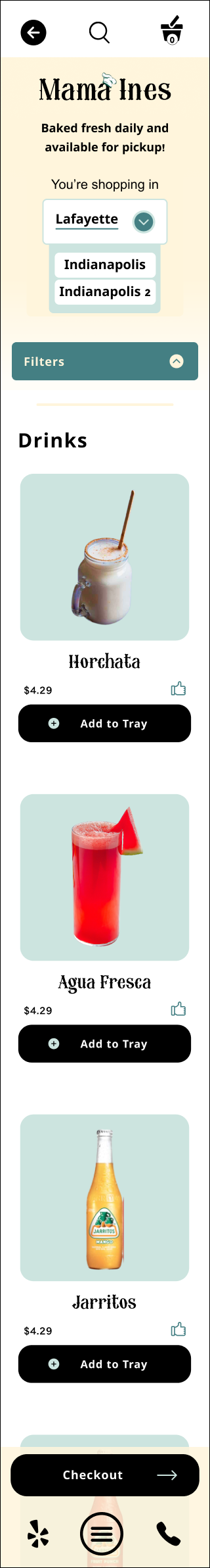
Order online and pickup at your selected available time.
Order your favorite pastries online for pickup.
Fill out a questionaire to generate an instant quote for a custom cake before submitting an order. Stop by the gallery for inspiration.
Generate an instant quote for a custom cake.
Stay in the loop with a summary page complete with your selected pickup time and directions to the location you ordered from.
Assure there's no pickup mixup.


Search, sort options and emphasis on information-architecture for easy access to website content.
Explore the full extent of services & offerings.
See what (and who) inspired the founder of Mama Ines and the history and passion behind the business itself.
Learn more about the people and culture behind Mama Ines.
...with a floating cart.
Move through the checkout process quickly & efficiently
Brief overview of the solution
Research insights
I set out for Mama Ines Bakery with the goal of understanding the motivations and expectations of online ordering and whether or not it is possible to find a successful balance between authenticity and modernization. To break it down further, I focused on the following objectives:
-
Understand current pain points and successes of online ordering
-
Determine what motivates/unmotivates users to order food online rather than in person
-
Determine what traits & characteristics users value in a bakery experience
To meet these objectives, I chose to conduct company and industry research, a competitive analysis, and user interviews. The overall insight: The user needs a mobile-optimized online ordering experience, pickup preferably, that they can trust and that prioritizes fresh food and convenience.
RESEARCH & DERIVING INSIGHTS
High-quality product photos
Online ordering
Newsletter signup
User's want consistency in pastries/food AND experience. The only change in consistency users welcome is modernization of the classics - for example, a matcha concha.
1. Consistency
Users want to get their food fast and fresh in a way that is convenient for them. Online ordering also: makes sure everything is right, limits wait time, flexibility for demanding schedules, easy to order and then pick up on the way home.
2. Convenience
User's need to be able to trust the business and they feel they can do so by getting to know the people & culture behind the business. "A family-owned business is not going to do you wrong. Very trustworthy." - User Interviewee
In general, user's also feel more trusting of online ordering. They feel there is less room for human error and that online ordering helps them feel supported & informed about the order, checkout, and pickup process. It also allows them to check reviews and ratings and gives them ample time to select the right items.
3. Trust
Users want consistent, high-quality products made from scratch. They are so invested in freshness, that they often seek out "Take and Bake" options and make items at home.
4. High-quality, fresh ingredients
Voluntary data collection AKA cookies
Online ordering
Easy booking services online
Family and history page
Reviews from customers
Online ordering
Online ordering
Search bar
Live-updating pop-up cart
Spanish to English translation tab
Newsletter signup
Key Insights
100% of participants preferred ordering online in some form
80% of participants said they were more likely to support a business that had online ordering
60% of participants didn't care about the ingredients as long as the bakery had good reviews and overall great taste
100% of participants primarily ordered from their phones
Other motivators for online ordering: no wait time, price transparency, variety of payment options, detailed descriptions of ingredients and names
Condensing & applying insights
Introducing Noel


IDEATION & WIREFRAMES
During user interviews, it was revealed to me that many current Mama Ines customers don't even know the full extent of the bakery's offerings - specifically, that they offer custom cakes and in-bulk orders. For this reason, I found it was very important to focus on information architecture for this project with a clear site map and user flows..
Site Map

Research-backed wireframes


REBRANDING + UI


While conceptualized the rebranded Mama Ines, I mostly focused on modernizing the design elements they already had. I simplified the logo but made sure to keep their iconic chef's hat. I introduced more colors to represent warmth [for warm bread, the warmth of family, and the businesses historic, cultural ties], while still utilizing the vivid colors tied to their culture in images and as accents. The [ABOUT] page on the site even highlights the original location in Lafayette, IN, to create a feeling of familiarity. Explore the style guide below.
Defining the brand and user interface.
Updated Logo
During user interviews, I discovered that users are most intrigued by a modernized approach to an authentic and proven brand.
Keeping the core concept of the original logo, the updated logo is slightly simplified. The new decorative font is easier to read and the colors offer more contrast.


TESTING
01. Difficult to locate cart
02. Confusion about order information
03. Would love an easier way to add or subtract food items

Testing the features
I chose to conduct usability testing focused on the online ordering process. Participants identified 3 repeat points of frustrations. They wanted more feedback throughout the online ordering process to assure they were doing it right. They also thought it could be further simplified. I worked through their feedback in the affinity map below before identifying the overlapping revisions that would be most beneficial to the user if fixed.
PRIORITIZED REVISIONS
01. Difficult to locate cart
My solution: Traveling cart that updates as you go, more obvious placement embracing well-known design patterns.


My solution: A summary page and more information to the confirmation page.
02. Confusion about order info


A research-backed, proven product.
FINAL DESIGNS
My solution: Add a stepper to the food item card
03. Would love an easier way to add or subtract items in the cart


OUTCOME & REFLECTION
-
Increased brand awareness and accessibility
-
More informed customers
-
Increased sale generation
Expected Results
An initial challenge was designing for a business so engrained in a culture I did not grow up in. To improve my understanding and assure I was making the most informed design decisions I could, I extended my research process to include exploration the culture of Zacatecas, Mexico. In addition to the above, prototyping stood out to me as an area I should work to improve.
My Challenges
-
Usability testing on the mobile version of the site
-
Continue to add more interactive elements that connect the user to the in-person space
-
More time on equity-focused design
Next Steps
Project Outcomes